I'm going through some charts in preparation for a guest appearance Sunday night at 7:00 PM New York time with the Macro Contrarian over at DYDD.org/TV. In doing so I came across some charts I want to share with you. I figure you are all professionals and these need no explaining. These are in no particular order Cheers!
US Unemployment by education with Labor Force Participation Rate overlay:
Global Unemployment:
Federal Reserve Deposits and Securities Held Outright:
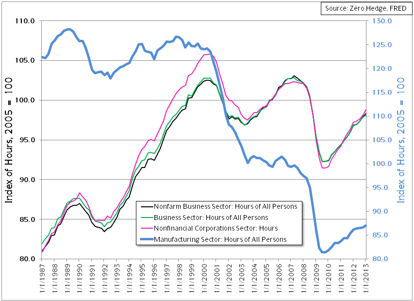
Quarterly Index of Hours Worked with 2005 = 100 on the Index:
US Ten Year Real Rate & AAA Corp Yield minus 3-Month CMT Primary & AAA Corp Yield minus 3-Month CMT Secondary Yield (I made a mistake in the red note box by not informing you that the yield is the spread against the 3-Month CMT, not the raw AAA Corp Yield):
EUR/USD and WTI Spot:


